NATURE’S WAY
Sarah came to me in 2018 when she was an entrepreneur about to embark on a journey to open a new health and wellness clinic in British Columbia. She originally reached out to me for a logo commission, but we have been working together ever since. It has been such a great experience working with her and through the years we’ve created and full branding profile and countless print projects. Below is the branding refresh we did a few years back when she refocused her business more toward the spa and wellness industry.

BRANDING
The campaign goal was a natural, holistic emoting brand mark that would grow with the Nature’s Way brand.
I wanted to incorporate a nature element into the design, as Sarah’s work is very holistic and natural.
We played around with leaves and trees, before finally settling on this tree imagery for the icon, and the charcoal and light sage green color scheme. The typography I chose is thin, open and modern which, alongside the color scheme and icon, evokes exactly the feelings of wellness, cleanliness, and the natural world that we were aiming for.
I also created several layout variations for Sarah to use in different settings. This was the original design in 2018 before her branding refresh a few years ago.

Sarah and I have worked on so many print projects over the years. I’ve featured a couple below.
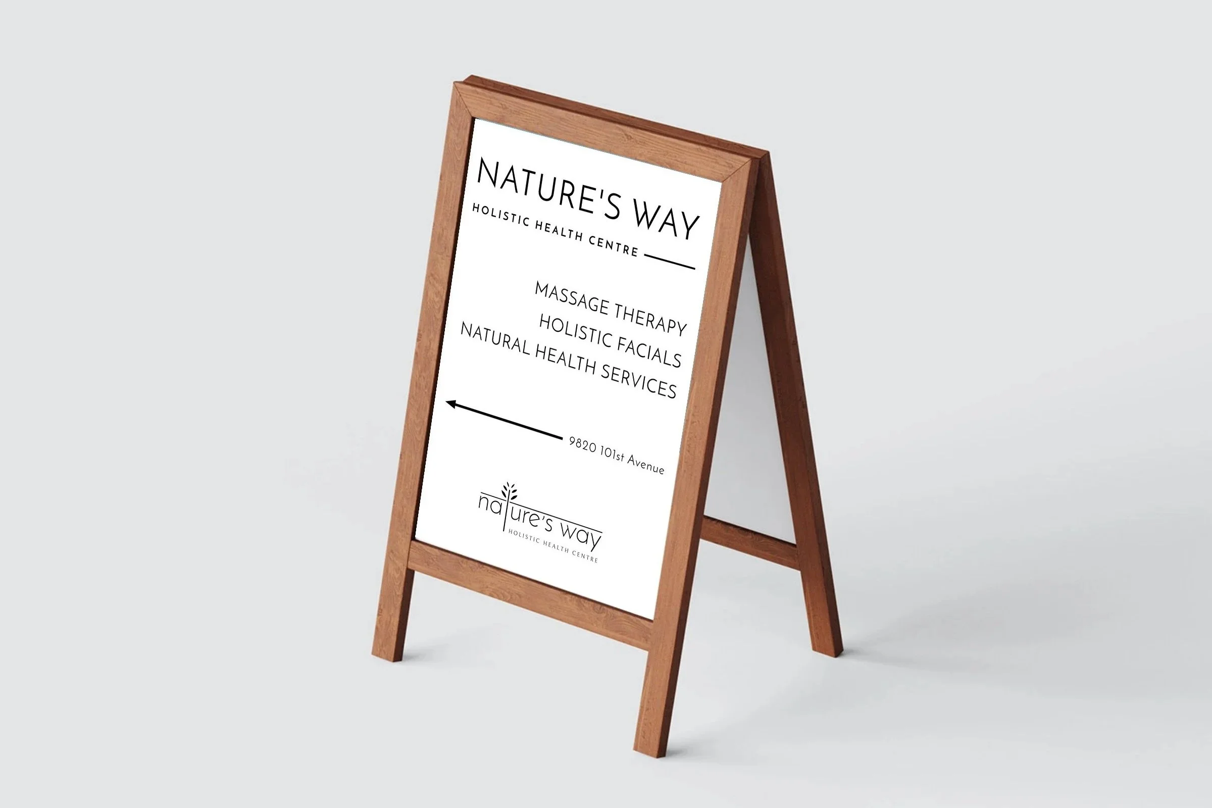
The sidewalk sign featured was commissioned to be setup outside the spa to direct foot traffic inside the centre.
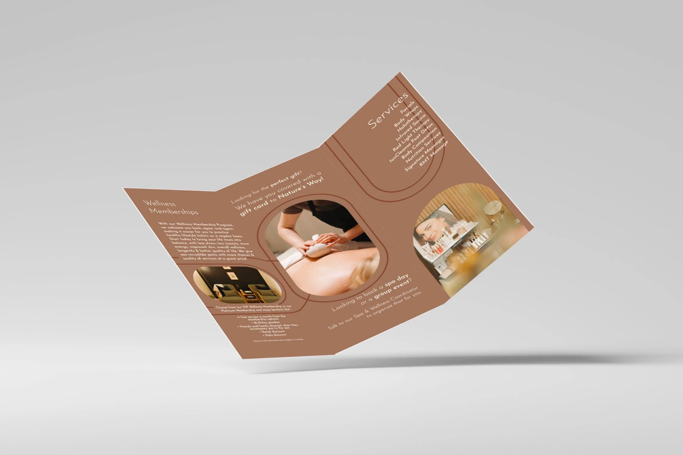
We have done several brochure designs over the years. This most recent design was commissioned this year in 2025 to include and exclude an updated list of services and prices since our most recent brochure design a year or two ago.
We updated to a trendier warm color theme and included several photos from the spa.