MIMOSA FEST
My long-time client Necoya Tyson (owner and founder of AAYEM and Mornings are for Mimosas), decided to venture out, and open up a completely new festival. We needing to put together everything from branding to a website to a full social media presence. Necoya is such a fun person to work with and be around, and I knew this Great Gatsby-inspired direction would be perfect fit for her new venture. We’ve tried to keep everything fun and bold, while still remaining on-trend and clean.
BRANDING
As I always do, we started with a full branding profile.
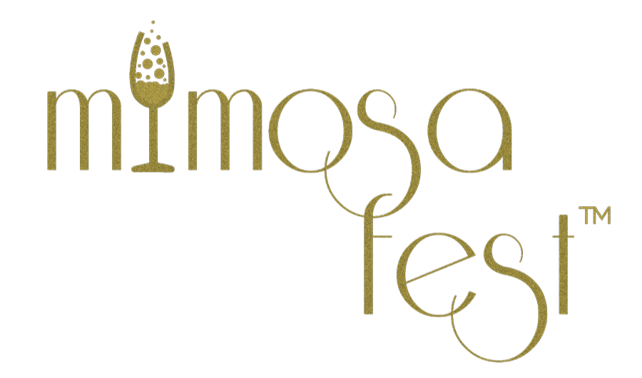
The campaign goal was to create a fun, elegant, ritzy logo for an event that would entice and feel alive.
I went with this Riesling font, and combined with the champagne flute letter mark it really sealed the ritzy/Gatzby vibes we were going for. I finished off the design by adding a glittery texture that gives the design some depth, but still translates well to print (after one or five iterations of textures that didn’t translate quite so well, but we did get there). We put together two different layouts and gold, black and white color options. We later added in an option with a subtitle with her All About You Event Management brand name to help with some trademarking issues she ran into, as well.


WEB
Just like with the branding, I wanted to make Necoya’s website bold and fun.
However, for this website design, we also primarily needed to convert visits to ticket purchases.
We opened up on the home page with a video ad we had put together for the festival. And we kept everything ritzy, fun and larger than life.

Most of the pages on the site were short and to the point, and instead focused on creating a fun energy and drawing in the attention of the viewer. Pages like the sponsor/vendor page had all the necessary information for those looking to partner with MimosaFest, but everything targeting the attendees was short and sweet—keeping the viewer interested and engaged.

Necoya needed a sponsor/vendor prospectus that contained all relevant information a prospective partner for the festival might need. Together we created a seven page brochure complete with details about all the sponsorship options, an application form, and all the options and details they’ll need for the event. This is a few pages from that brochure.

Below I’ve featured a few of the print graphics Necoya commissioned for her first MimosaFest. We did three large scale banners (24”x87”) (two pictured left), wallet-sized free drink cards (center, top), floor decals (top, right), lollipop signs for a Photo Booth she had setup (three of 11 are featured bottom, right), along with several other placards, tabletop signs, as well as a Step and Repeat.

DIGITAL
Below I’ve included some designs from two different campaigns I did for Necoya. The black and gold color scheme was from her first Mimosa Fest social media campaign in 2021-2022. The blue and orange color scheme is from the Mimosa Fest social media campaign in 2022-2023.


